Find Harmony with Triadic Color Palettes

Understanding Triadic Harmony

Triadic palettes use three hues evenly spaced around the color wheel, typically 120 degrees apart. Think red–yellow–blue or cyan–magenta–yellow. This spacing stabilizes energy across your palette, ensuring no single hue overwhelms. Comment with your favorite triad and why it resonates.

Understanding Triadic Harmony

Because each hue claims equal territory, triads preserve tension and harmony simultaneously. Designers often cite Johannes Itten’s teachings on contrast to explain this duality. The result is lively vibrance without chaos. Subscribe for deep dives into the psychology behind harmonious color choices.

Understanding Triadic Harmony

Classic triads include red–yellow–blue for bold clarity, orange–green–violet for approachable warmth, and cyan–magenta–yellow for modern, print-friendly punch. Try lowering saturation for elegance or raising contrast for playful branding. Share your swatches and tag us for feedback from the community.

Designing the Dominant, Secondary, and Accent

Choose a Purposeful Dominant Hue

Let your dominant color reflect values—trust, innovation, or warmth. If your brand champions clarity, choose a clean blue; for creativity, a vivid magenta. Keep the dominant hue generous in backgrounds or large surfaces. Tell us which value you want your audience to feel first.

Control Saturation and Value for Calm

Reduce saturation or darken values to quiet a triad without losing identity. A moody violet can steady a lively orange and green. Gradations and tints carve depth, guiding attention gracefully. Subscribe for printable value scales and gentle exercises to practice tonal balance.

Use Neutrals to Let Triads Breathe

Introduce soft grays, off-whites, or charcoal to prevent color fatigue. Neutrals create resting space between triadic notes, much like silence in music. Add texture—linen, matte paper, concrete—to enrich subtlety. Share photos of your neutral pairings; we’ll feature standout compositions.

A Café Story: From Bland to Brilliant

A neighborhood café switched from a muddy monochrome to a cyan–magenta–yellow triad with a deep gray anchor. Sales of seasonal specials rose as signage became instantly recognizable. The owner said guests began ordering “the cyan drink.” Tell us if a color ever made you try something new.

Contrast, Accessibility, and Trust

Triads can fail if contrast is weak. Test color pairings for legibility, ensuring sufficient contrast ratios for headings, buttons, and body text. Accessibility builds trust and reach. Subscribe for our contrast checklist and share your brand buttons for constructive community critique.

Consistency Across Media

Define hex, RGB, and CMYK values for every triadic hue, plus tints and shades. Document usage rules for backgrounds, type, and accents. A style guide is your compass when projects multiply. Comment if you want a downloadable triadic style-guide template in the next issue.

Interior Design with Triadic Harmony

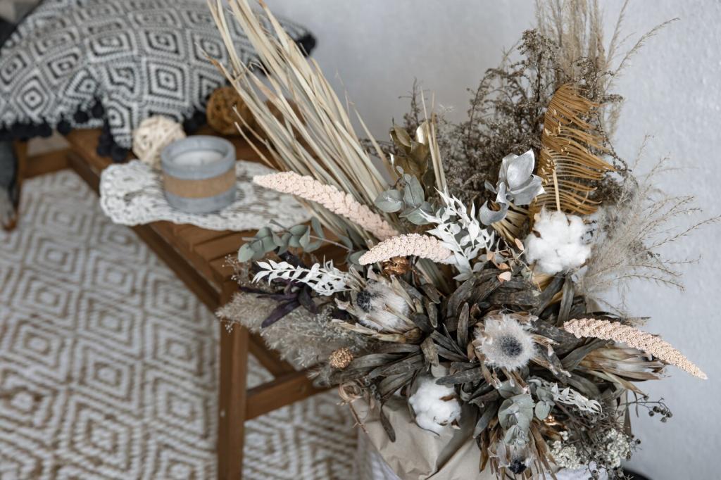
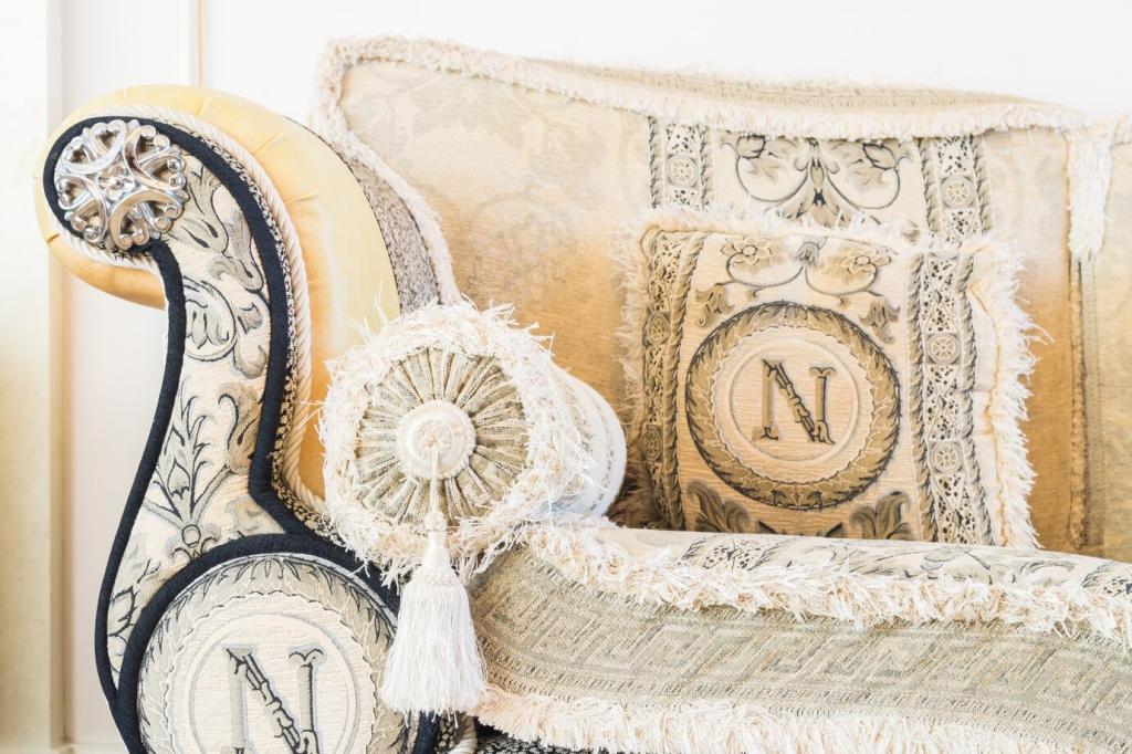
Try a muted orange–green–violet triad: terracotta cushions, sage drapery, and a lavender throw. Add oak and ivory to soften edges. One reader reported guests relaxing longer and noticing bookshelves first. Share your living-room palette and what you hope people notice upon entering.

Interior Design with Triadic Harmony

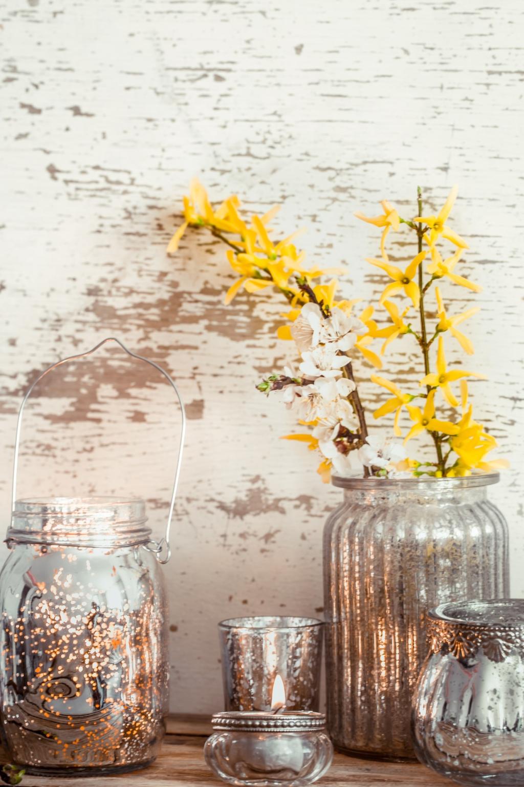
Lower saturation to avoid visual fatigue. Dusty teal, softened coral, and gentle mustard create warmth without noise. Texture—wool, clay, paper—adds tactile calm. Subscribe for our printable triad mood boards that map paints, fabrics, and lighting choices for effortless harmony.
Let the dominant hue shape primary actions, reserve the secondary for navigation, and use the accent for microinteractions. Motion and color timing matter. Keep hover states accessible. Comment with a link or screenshot, and ask the community which element steals focus first.
Use a triad to separate categories, then apply tints for series depth. Avoid neon competition by softening two hues and reserving one for critical highlights. Subscribe to receive a trio of downloadable chart palettes tested for readability and color-blind accessibility.
Assign consistent roles: success, warnings, errors, and info using your triad’s relationships. Calibrate saturation to keep meaning clear under dark and light modes. Share your component library colors; we’ll review visibility pitfalls and celebrate smart, balanced solutions.

Photography, Fashion, and Styling

Consider a navy-leaning blue, a warm mustard, and a softened crimson for portraits. Keep one hue dominant, then echo the others in shoes or jewelry. Post your lookbook experiments and tell us which detail viewers commented on first.

Photography, Fashion, and Styling

A triad shines when props echo hues subtly: a teal ceramic, a magenta ribbon, a yellow lemon under soft window light. Textured backdrops reduce glare. Subscribe for our prop checklist designed to keep shoots cohesive without feeling staged or heavy-handed.
Agrivozzo
Privacy Overview

This website uses cookies so that we can provide you with the best user experience possible. Cookie information is stored in your browser and performs functions such as recognising you when you return to our website and helping our team to understand which sections of the website you find most interesting and useful.