Bold Balance: Complementary Color Pairings for Interiors

Understanding Complementary Color Theory at Home

The Color Wheel, Simplified for Interiors

Complementary colors sit directly across from each other on the wheel. In homes, that means pairing blue with orange, red with green, or yellow with purple to create balance, focus, and depth without visual chaos.

Warm Meets Cool, Energy Meets Calm

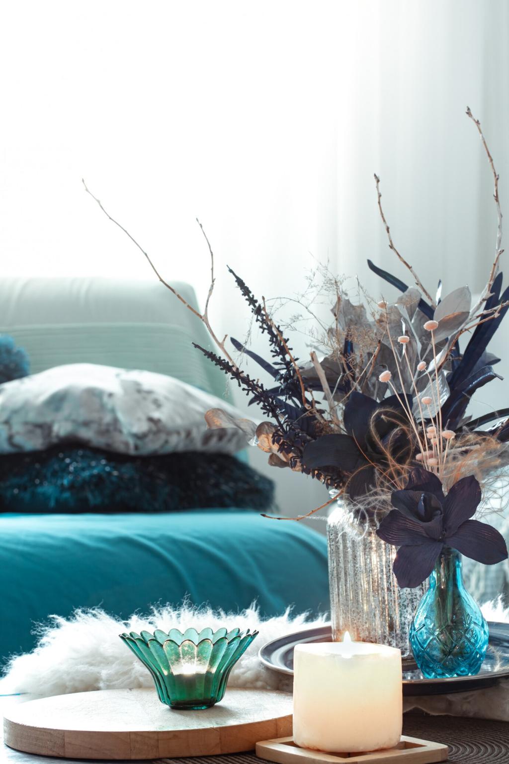
Pairing warm and cool opposites manages mood. A warm orange pillow against a cool blue sofa sparks energy, while leafy greens beside deep reds feel grounded. Your goal is contrast with comfort, never color shouting.

Light Changes Everything

Natural light, bulb temperature, and sheen can shift how complements read. Test swatches morning and night. A soft eggshell orange may glow at noon yet feel more amber under warm lamps after sunset.

Blue and Orange: Refreshing, Modern, and Versatile

Coastal Without the Cliché

Trade nautical anchors for tactile layers: indigo linen curtains, a denim slipcovered chair, and a few terracotta pots. Small sunset-orange ceramics give warmth, while natural jute grounds the pairing beyond beach-house stereotypes.

Burnt Orange Accents in Navy Rooms

A navy room feels sophisticated but needs lift. Add burnt orange velvet cushions, a clay lamp, and a patterned kilim. The complementary pop creates rhythm, while matte finishes keep the contrast gently controlled.

A Kitchen That Sings

Try powder blue cabinets with copper cookware and orange-toned cutting boards. The metal’s gleam acts like a highlight, nudging the complementary relationship into a lively, functional space you’ll actually cook in and gather around.

Red and Green: Beyond Holiday Associations

Muted complements feel timeless. Sage walls with brick-red textiles whisper warmth rather than shout. Add raw oak, linen drapes, and soft brass hardware. The look reads elegant farmhouse, not festive flash.

Red and Green: Beyond Holiday Associations

A leafy gallery wall beside a wine-red rug deepens a living room. Balance crisp white trim and leafy plants to temper richness. The pairing feels cultivated, like a quiet library with life peeking through.

This is the heading

Lorem ipsum dolor sit amet, consectetur adipiscing elit. Ut elit tellus, luctus nec ullamcorper mattis, pulvinar dapibus leo.

This is the heading

Lorem ipsum dolor sit amet, consectetur adipiscing elit. Ut elit tellus, luctus nec ullamcorper mattis, pulvinar dapibus leo.

Proportion, Texture, and Finish: Making Complements Livable

Let one neutral dominate at 60%, your primary hue at 30%, and the complementary accent at 10%. This keeps energy focused, guiding the eye without exhausting it, especially in open-plan spaces.

Proportion, Texture, and Finish: Making Complements Livable

Rough ceramics, bouclé upholstery, rattan, and velvet change how light bounces across color. High-contrast pairs feel friendlier when at least one surface diffuses light and adds touchable dimension.

A True Story: A Tiny Studio Finds Big Balance

Twelve feet wide, one big window, beige everywhere. The owner felt invisible in her own space. She craved color without clutter, and a mood that could shift from focus to quiet unwinding.

A True Story: A Tiny Studio Finds Big Balance

We sampled teal throw covers against soft gray and introduced rust cushions, a clay planter, and a woven rust-and-cream rug. The teal cooled the afternoon heat, while rust added soulful warmth without noise.

A True Story: A Tiny Studio Finds Big Balance

Friends said the studio finally felt like her. The complementary duo created zones: teal near the desk for focus, rust by the sofa for rest. Thinking of trying this? Comment with your room’s challenge.

Hands-On: Fast Swatch Exercises to Build Confidence

Cut colored papers into stripes and tape them in corners, near windows, and behind lamps. Watch them morning to night. Swap placements to see how complements interact across light, shadow, and furniture.

Hands-On: Fast Swatch Exercises to Build Confidence

Gather items in one hue and its opposite—scarves, books, ceramics. Create a small vignette on a tray. Photograph it from different angles. Which balance feels livable? Share your favorite combination with us.

Hands-On: Fast Swatch Exercises to Build Confidence

Snap a photo and turn it to black and white. If values are too similar, your complements may blend instead of pop. Adjust saturation or value until the contrast reads clearly and comfortably.

Seasonal Tweaks: Keep Your Complementary Palette Fresh

Spring and Summer Lightness

Swap heavy textiles for airy cottons. In blue–orange rooms, lighten orange to peach and add woven baskets. The balance stays complementary while feeling breezier, ready for open windows and longer days.

Autumn and Winter Depth

Lean into richer values—navy with burnt orange, eggplant with chartreuse velvet. Introduce candlelight and wool throws. The increased texture and shadow enhance contrast, creating warmth without sacrificing energizing opposites.

Care and Continuity

Maintain color clarity by cleaning fabrics and conditioning leather. Rotate art to echo your duo. Want more ideas? Subscribe for monthly complementary palette prompts and share your seasonal refresh with our community.
Agrivozzo
Privacy Overview

This website uses cookies so that we can provide you with the best user experience possible. Cookie information is stored in your browser and performs functions such as recognising you when you return to our website and helping our team to understand which sections of the website you find most interesting and useful.