
Analogous Color Schemes for a Calming Home
The Science of Gentle Contrast
Analogous schemes keep hue shifts subtle, minimizing visual noise and cognitive load. Your brain recognizes continuity, not conflict, which lowers stress. This is why greens drifting into blue-greens and blues feel like a slow, steady breath for your home’s atmosphere.
How Your Eye Reads Neighboring Hues
Your eye prefers smooth transitions. When walls, textiles, and accents move gradually from one hue to the next, you experience flow. That flow becomes calm, inviting you to linger longer, speak softer, and feel present. It’s sensory kindness, rendered through color.
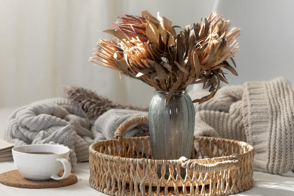
Anecdote: The Blue‑Green Nursery That Finally Slept
One reader layered misty blue walls with blue‑green curtains and a soft teal rug. Bedtime battles evaporated. The baby’s gaze slowed across the room’s gentle gradients, and naps grew longer. Share your own analogous success stories so others can try similar soothing palettes.
Building Your First Analogous Palette
Pick a Base Hue with Intention
Choose a color that reflects how you want the room to feel. For serenity, blue or green families excel. For warmth, try peach or soft terracotta. Name your goal, then let that base hue become the steady heartbeat guiding every other choice.
Flanking Hues and a Grounding Neutral
Select two neighbors on the wheel, one slightly cooler and one warmer, to create depth without chaos. Ground everything with breathable neutrals like warm white, stone, or linen. Neutrals are the quiet pauses that make your analogous melody sing beautifully.
Test Swatches in Real Light
Tape large painted samples on multiple walls and observe morning through evening. Analogous schemes shift gracefully with daylight, but you still need proof. Take photos, note feelings, and ask your household to vote. Comment with your favorites, and we’ll help refine the mix.

Living Room: Blue, Blue‑Green, Green
Paint walls a featherlight blue, layer a blue‑green sofa, and finish with sage cushions. Use natural textures to echo shoreline calm. The effect encourages slow conversations and restful evenings. Share your living room palette picks for feedback from our color‑loving community.
Bedroom: Blush, Peach, Soft Coral
For a warming hush, choose blush walls, a peach throw, and soft coral art. These neighbors glow at dusk, easing you from wakefulness to rest. Keep metals muted and fabrics tactile. Subscribe for our printable palette cards to tape to your headboard for guidance.
Kitchen: Sage, Olive, Moss
Choose sage cabinetry, olive stools, and moss linens for organic freshness. The green family calms errand‑tangled minds while you cook. Add creamy tile for balance and matte black hardware for punctuation. Tell us which green trio suits your light, and we’ll suggest adjustments.
Textures, Materials, and Sheen with Analogous Colors
Matte and eggshell finishes soften reflections, enhancing the tranquil drift between neighboring hues. Gloss can sparkle, but too much agitates. Try matte on large wall planes, eggshell for wipeable surfaces, and keep high gloss to small accents to avoid visual clatter.
Linen, wool, jute, and rattan translate the palette into touch. A blue‑green wool throw beside a sea‑glass linen curtain keeps the story tactile. Layer gentle textures so your eye and hand agree: this room whispers, not shouts. Comment with your favorite fabric pairings.
Choose one primary metal—brushed nickel with cool palettes, aged brass with warm—and repeat it. Pair with woods that share undertones. Ash loves cool blues; oak flatters peaches. Consistency is calming. Post your metal and wood combinations, and we’ll help fine‑tune undertones.
Small‑Space Strategies with Analogous Hues
Paint the sleeping nook the deepest neighboring hue, the lounge area mid‑tone, and the entry the lightest. The gradient creates depth without walls. Repeat a single neutral across rugs and curtains to unify. Share your floor plan, and we’ll suggest an effortless three‑step gradient.
Nature and Culture as Analogous Inspiration
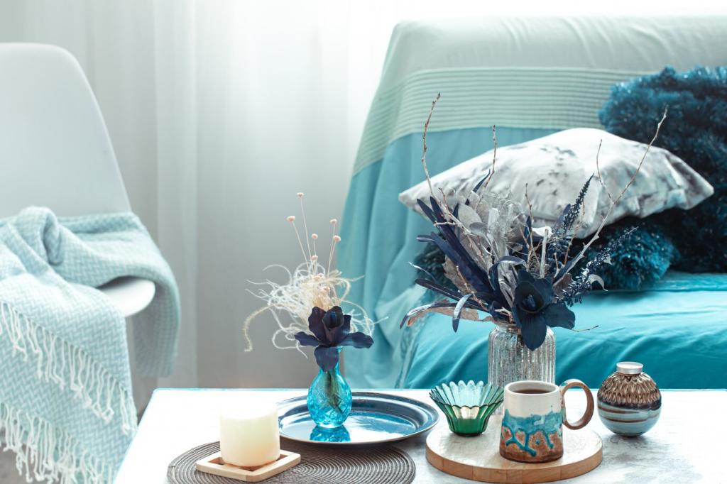
Seaside Dawn: Mist, Aqua, Deep Water
Think of the horizon at first light: misty gray‑blue above pale aqua, sliding into deep blue water. Recreate it with paint, textiles, and art. This palette slows breathing and lengthens pauses. Share your seaside photos, and we’ll extract analogous swatches you can try.
Forest Understory: Fern, Moss, Pine
From fern tips to moss carpets and pine shadows, greens neighbor gracefully. Use this trio for libraries and studies where focus and ease coexist. Add bark‑toned wood and stone. Tell us which greens appear outside your window, and we’ll align undertones with your view.
Ceramics and Textiles: Warm Neighboring Reds
Traditional pottery and woven textiles often blend terracotta, cinnamon, and soft umber. Translate this to dining rooms for grounded warmth. Keep lighting amber and diffused. If you have heirloom pieces, share photos, and we’ll suggest an analogous setting that honors their story.
In summer, brighten the lightest neighbor; in winter, deepen the darkest. Swap textiles rather than repainting. The palette stays coherent, the mood remains calm. Comment with your season, light conditions, and goals, and we’ll recommend subtle transitions that feel seamless.
Carry a small card showing your three neighboring hues and your neutral. Before buying, compare undertones. If it clashes, let it go. Discipline protects calm. Subscribe for a printable wallet card and community check‑ins where we troubleshoot tempting but off‑palette finds together.
Post before‑and‑after photos, ask for undertone help, and vote on other readers’ palettes. Your experiences guide newcomers, and their ideas spark fresh variations for you. Follow and subscribe to keep our weekly analogous color challenges and gentle home inspiration arriving reliably.